



A website for the people who need it most –
St Barnabas Hospice
Accessible by design
Not your typical website rebuild
One site, an unusually wide range of people, all of them needing one thing, the St Barnabas website to function well, for all of its purposes. Patients and their families. People living with dementia. Bereaved supporters. Volunteers, donors, shoppers across the charity’s retail estate.
Accessibility and dementia-friendly design drove every decision, from the first concept, to the last, not sprinkled in, or even worse an after thought. Alongside the usual charity website checklist: clear giving options, a content system the St Barnabas team could run themselves, something built to carry fundraising campaigns for years.
The problem.
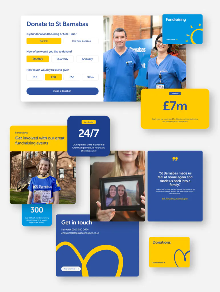
St Barnabas Hospice supports more than 12,000 people a year across Lincolnshire, through its care services, its shops, and the wider community. Some of the hardest moments of people’s lives. The St Barnabas website needed to carry that same weight.
The website wasn’t keeping up. It was outdated. The navigation was inconsistent. Accessibility had been an afterthought. And getting from the homepage to a completed donation took more clicks than it should have. St Barnabas wanted the opposite of a quick lick of paint. They wanted every decision backed by evidence.
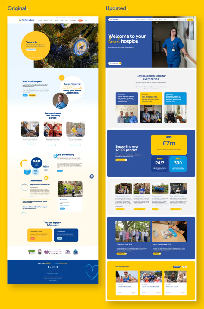
How we got there.
Research led, not opinion led. Using Lyssna, we tested design decisions with real participants, including St Barnabas supporters, before a single page went into build.

Four homepage hero concepts, tested with 42 participants: a clear winner emerged
Three navigation structures, tested head-to-head against finding the Hospice at Home page
Three mobile menu concepts, tested on how fast people could find key actions
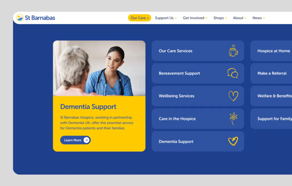
Dementia shaped the research.
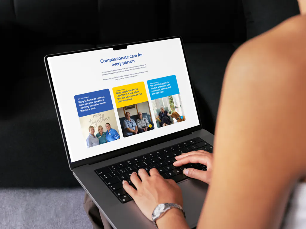
That research fed straight into the details. Plain language, short sentences, a home link on every page, calm visuals with barely any animation, and colour and icons that mean the same thing wherever you see them. Tap targets are big enough to hit without aiming. Text runs at a 16px minimum, so nobody’s squinting. Navy, yellow and white, chosen for contrast rather than branding.
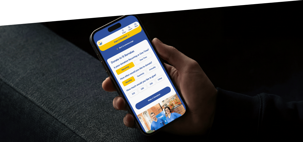
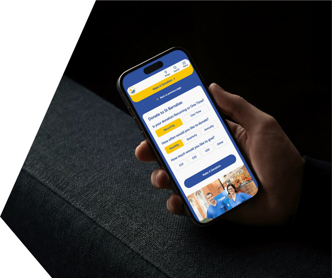
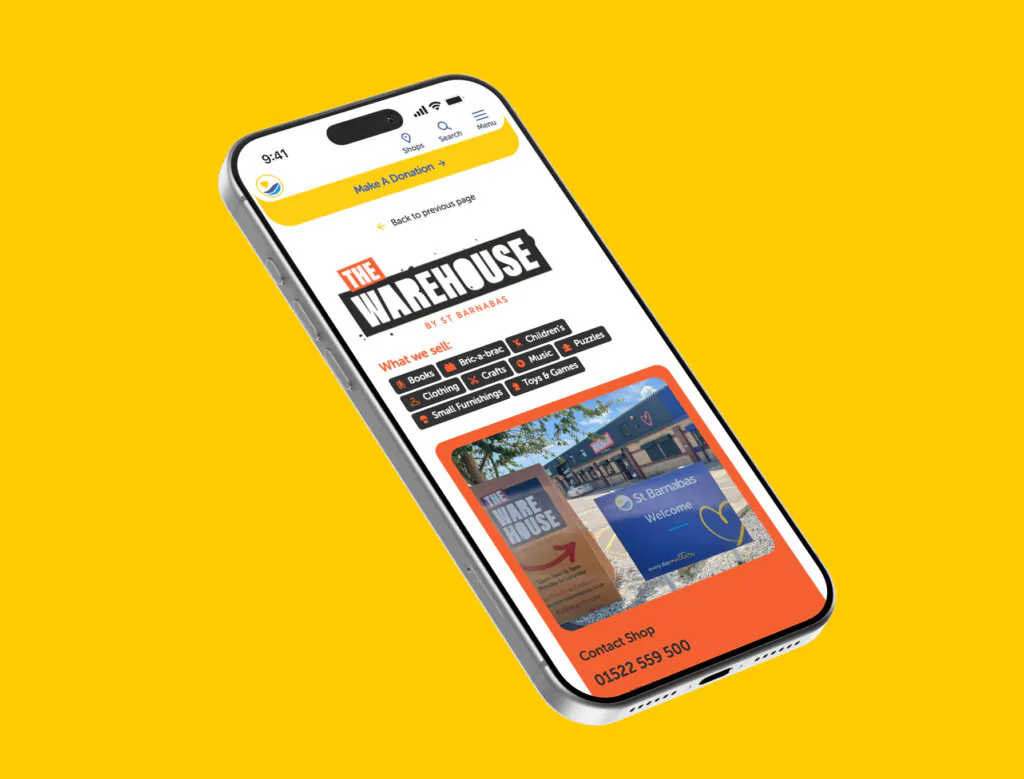
The supporter and donation journeys got the same treatment, mapped end to end: general giving, in memory, corporate, fundraising, all in plain English, all fewer clicks from the homepage than before. The build itself is mobile-first, on modern secure hosting, with a content system flexible enough for the St Barnabas team to build new pages and appeals without calling us first.
We run St Barnabas’s paid search too, on an ongoing retainer, so the same team building the site is steering the traffic landing on it.
What changed?
The winning navigation structure got 86% of people to a key page in 7 seconds. The runner-up managed 57% in 15 seconds, more than double the time, for fewer people finding what they needed. Homepage testing told the same story: the winning design was the clear favourite over the runner-up. Neither result was close.
Speed followed the same pattern: main content visible in 0.9 seconds, a performance score of 99 out of 100.
“This project has been over a year in the making, and we’re delighted to finally share it with you. We’d also like to say a big thank you to Laser Red, who worked with us to bring the new website to life.”
Amelia Chambers,
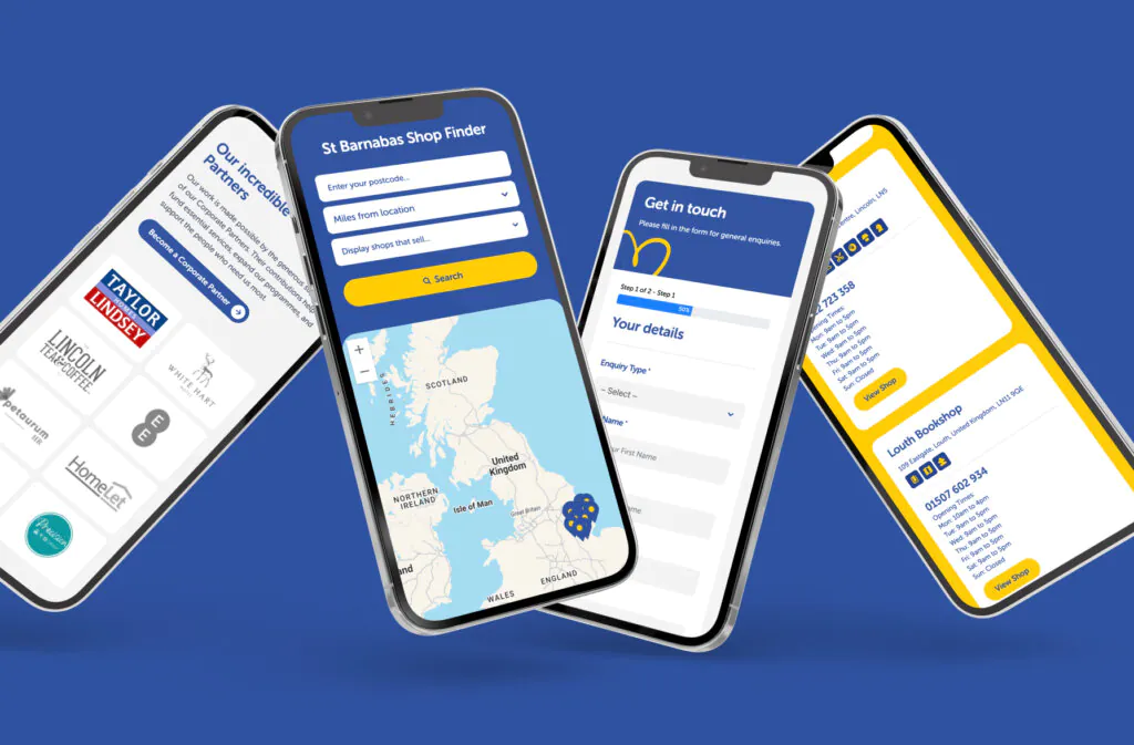
What’s new?
None of this stopped at launch. We still review the site’s UX, still watch how people actually use it in Hotjar, and keep making the same evidence-led changes we started with. A hospice website is never really finished, it just keeps getting better for the people who need it.
The website launched with all of the technical SEO set up and ready to go, it is AEO ready, meaning St Barnabas is able reach a whole new audience who are searching for answers using AI.
Finally the site is built with data security in mind, alleviating some of the worries around cyber security.

Apple Pay for one-off donations
A smoother Regular Giving journey
General, in memory, corporate and fundraising giving, each its own clear path
A proper events calendar for wellbeing sessions and fundraising events
Online booking for education and training courses
A content system the St Barnabas team can use to build pages and campaigns themselves
Mobile-first build on modern, secure hosting

99/100 performance score, main content visible in 0.9 seconds
86% task success in 7 seconds for the winning navigation structure, versus 57% in 15 seconds for the weakest
34% preference for the winning homepage concept among 42 participants, ahead of 27% for the runner-up
